
(This is the second installment of my ongoing adventures with formatting the perfect e-book. Last week, my adventure began, and these posts are aimed at the author seeking to create better e-books on their own)
I’ve managed to create my first fully formatted EPUB, using The Inventor’s Son: The Beginning as my experimental book. I put drop-caps, made the title page look FAR less crummy, and put the cover on it.
However, I converted the EPUB to a MOBI file, using Calibre this morning, and my drop-caps are now broken. Sob!
So, now I’m going to use Kindle Previewer. This program will also convert my EPUB into a MOBI for Amazon readers. It’s going to be interesting to see how much tinkering I will have to do to get my MOBI files to look good, and it will be even more interesting to see how my EPUBs look in Nook, Kobo and Google Play Books apps on my tablet and phone. Last night, I attempted to view my EPUB through the Nook app for Windows 8.1. Eeergh! Now only did the drop caps disappear entirely, the letter was on it’s own line! Blah!
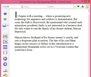
To illustrate: I’m aiming for a dropped cap
(which isn’t quite where I want it in this screen shot)
and a bit better looking text.
This is the EPUB viewed through Calibre:
Now, here’s the MOBI I
converted with Calibre this morning, still being viewed with Calibre:

And the same EPUB,
as converted with Kindle Previewer into a MOBI file:

You can see the differences, which is a bit dismaying. So, I think the solution will be tweaking the Cascading Style Sheet I’m using in the EPUB, which hopefully will convert a bit better with the Kindle Previewer.

Pingback: Geeking Out With Sigil and EPUB Creation, Part 3 | S B James, Doing the Write Thing
Pingback: Geeking Out With Sigil And EPUB Creation, Part 4 | S B James, Doing the Write Thing
Pingback: Geeking OUt With Sigil And EPUB Creation, Part 5 | S B James, Doing the Write Thing